Since I have been painting with pastels, there has been a debate as to whether a pastel painting should be “protected” by spraying it with varnish or some other fixative to prevent the pastel dust from coming off the surface. I have always been opposed to it since I know that pastel pigment dissolves when it gets wet, flattens out and loses it’s luminous quality.
In all honesty, I would love to find a way to protect a pastel painting without having to frame it under glass, or cover it with glassine until it is framed. I would love to find a way to protect the surface and be able to not have to worry about ruining them. But I want all of this without losing the quality that make pastels so beautiful.
I decided to try some experimenting.
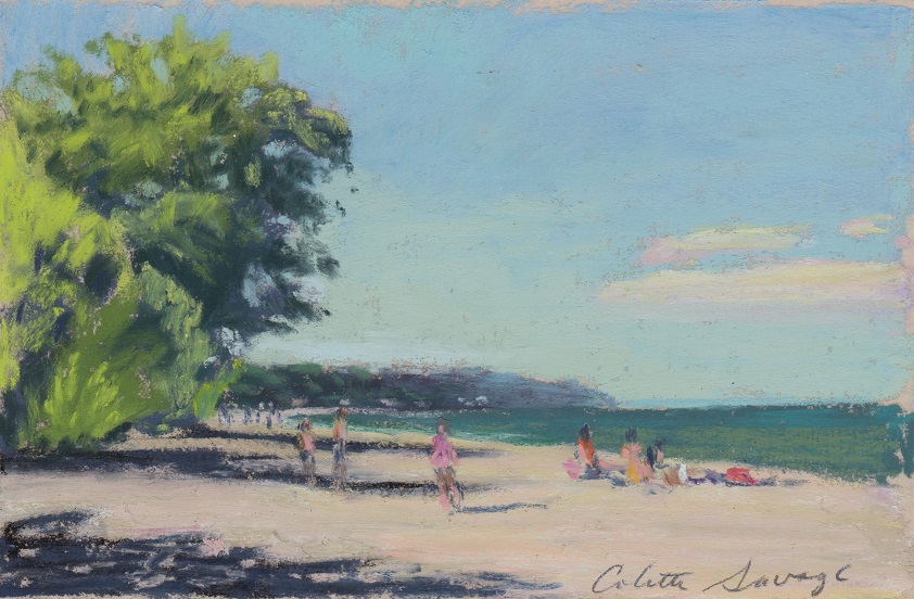
First, the painting I tested this on was done on a piece of UART paper. The painting itself is NOT my original design. It is a copy of another artist’s painting which I used as teaching tool. Because of that, I will only be showing you small sections of the painting. A wide variety of pastels were used.
The fixative is UV Archival varnish by Krylon.
This first image shows a cross-section of the painting before anything was sprayed on it.

Next, I covered half of the pastel with glassine to keep one side fixative-free.
I sprayed a light coating of the varnish on the exposed side of the pastel. It left dark spots of varnish all over it.
Extreme close-up of the dark spots.
The spots never went away, but they got a bit lighter after 15 minutes. Next, I applied a light, even coat of varnish to the exposed side. The colors became much deeper and intense.
After letting this dry for the next hour, the colors evened out and lightened a bit.
After it dried I lifted the glassine to expose both sides. The sprayed side seemed pretty obvious to me. It is darker, however none of the pastel came off on my fingers when I touched it! A real first for a pastel!
In conclusion, the spray varnish definitely did change the painting. It intensified the colors, made them darker and seemed to allow the darker valued colors that were first laid down to be seen through the top layers of pastel. That made it look kind of sloppy. I think the painting lost some of it’s crispness, too. That is no surprise since the particles of dust became fused together when they were dissolved by the spray and then dried. I was pleasantly surprised that none of the dust came off on my hands, however. I did find that to be intriguing.
It all leads to a lot of questions:
How long is archival?
Will the spray effect the paper over time?
What happens if the painting comes in contact with water?
Can the surface be cleaned?
If so, by what and how?
Although this is technically a pastel painting, is it really a pastel painting since it has been altered?
Is it marketable as a pastel painting?
I think I will have to play around with this a bit more to fully understand the possibilities this offers, both good and bad. I have said it before and will say it again, I never get tired of what I can do with pastels!